
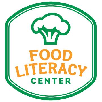
Food Literacy Center Serves Up New Name & Logo
Sound the huckleberry horn! Food Literacy Center has dropped “California” from its name and developed a brand new buzzworthy logo with the pro-bono help of Honey Agency.
Like the little engine that could, Food Literacy Center has grown from having two volunteers in 2011 to now having 70 active volunteers, employees and a physical office! A brand update was important for the nonprofit because it’s growing so quickly. Its former name was too long for people to remember and because the word “California” was a part of it, many assumed that it was a fully funded state agency. In fact, Food Literacy Center is a small, grassroots 501c3 nonprofit with only two employees hoping to reach more schools and more kids.
“We can’t afford to have our name give off a false impression that we don’t need help,” Founding Executive Director Amber Stott said.
At the moment, Food Literacy Center has raised $90,000 this year and it hopes to raise the amount to $250,000 by the end of the year. Considering that 2,400 kids are reached per year, that’s a meager budget. In addition to teaching food literacy at schools and public libraries, the nonprofit also runs the Food Literacy Academy, which trains community members as food literacy advocates.
“We use our donors’ money wisely, leveraging the power of volunteers to grow. Yet, we need additional funds to serve more kids,” Amber added.
The name change also brought about the need for a new logo. “While we loved our old logo, we needed a new look that reflected the simplicity of our approach to healthy eating,” Amber noted. She worked closely with the team at Honey Agency to shape her thoughts and ideas into a logo that is perfect for Food Literacy Center. Because Meghan Phillips and her team love fruits and vegetables, they truly understand the Center’s core message and mission.
“I’m sending a hot pepper high five to the team at Honey Agency,” says Amber. “They analyzed every detail of our marketing data, asked me to do a lot of brain dumping to tune into our current brand, and then buzzed it all into a beautiful new logo and accompanying graphics that capture the fun, smart, approachable essence of our work.”
In addition to helping Food Literacy Center create a gorgeous new logo and images, Honey Agency also created an invaluable brand guide that can be handed to board members. This document includes talking points, how to use the new graphics and how to promote Food Literacy Center’s brand. A strong brand is just as important to a nonprofit as it is to a corporation.
“It’s a name that sticks, messaging that people remember and images that inspire,” Amber said. “We want people in the community to think of Food Literacy Center when they think about the charities that are doing meaningful work.”
Three chicory cheers to Food Literacy Center’s new name and its fun and fresh logo!
Story by Heather Teoh